


Apple Joins AI Icon Race With Ambiguous New Siri Logo
Last week marked an exciting development for the AI community as Apple joined the long-standing competition among tech giants like Google, OpenAI, Anthropic, and Meta to create an icon that effectively represents AI to users. However, like its competitors, Apple’s attempt is abstract at best.
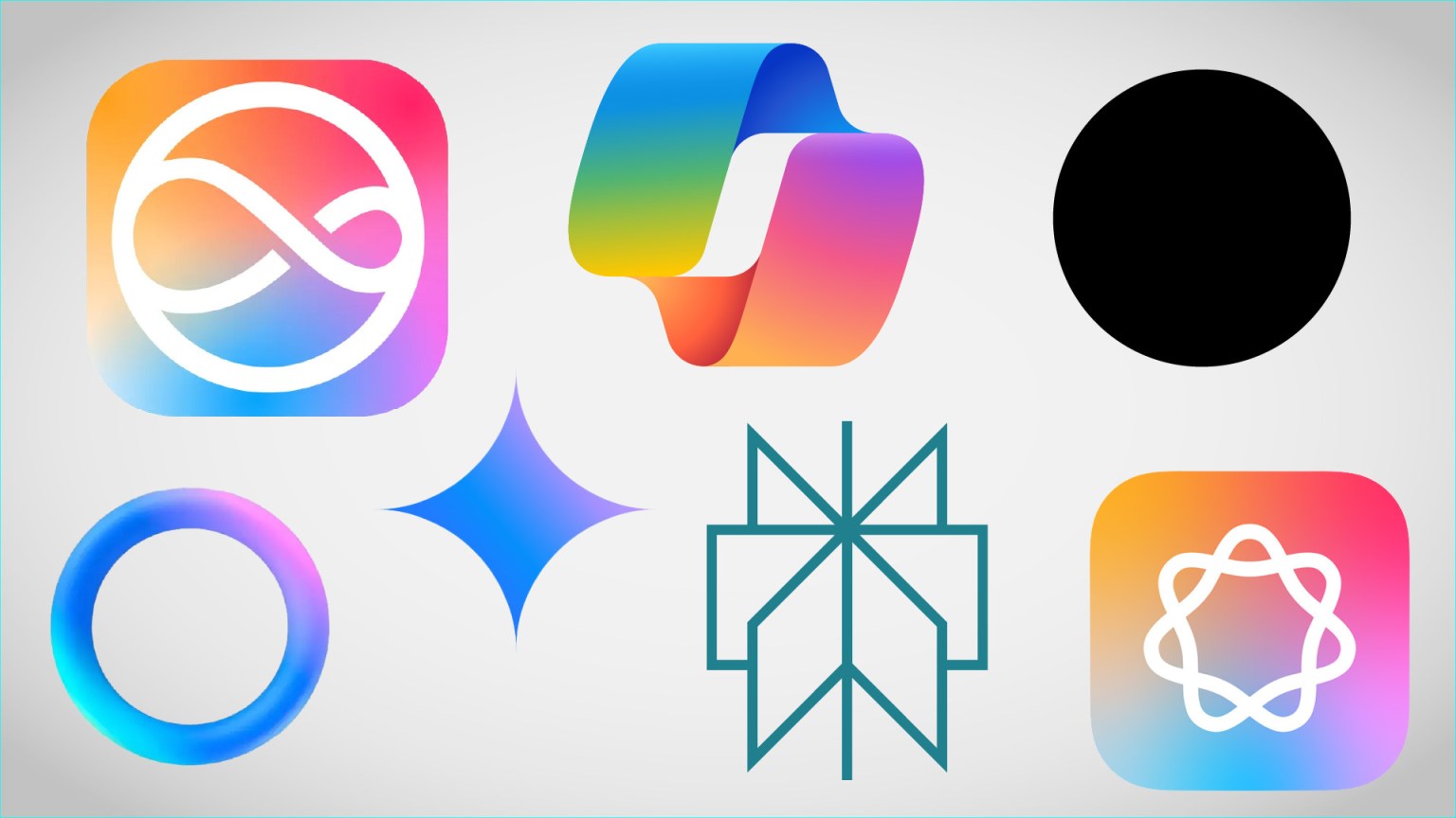
Apple’s AI, or Apple Intelligence, is symbolised by a circular shape with seven loops. Alternatively, it could be seen as a circle with a lopsided infinity symbol inside. This representation, or the phone glowing around the edges, signifies New Siri, powered by Apple Intelligence.
The challenge lies in that AI, which performs numerous tasks but lacks a physical form, is challenging to represent visually. Companies aim for icons that indicate interaction with a machine learning model rather than just an essential function like searching or submitting.
Despite varied approaches, AI branding has converged on a few fundamental principles: the icon should be non-threatening, abstract, simple, and non-anthropomorphic. Early AI icons, such as robots or magic wands, were rejected for suggesting rigidity, inhumanity, or irrationality—qualities these companies want to avoid.
Corporate logo design often involves a mix of solid vision, commercial necessity, and committee compromise. This is evident in the AI icons from different companies. OpenAI’s black dot, a featureless void, contrasts with the colourful, approachable designs of others like Google’s star or Perplexity’s endless book.
These icons use pleasant candy colours and soft gradients, creating a friendly and open impression. They animate in use, giving a sense of life and responsiveness. However, they avoid suggesting expertise, efficiency, decisiveness, or creativity.
Design documents for these logos likely run extensive, reflecting the companies’ obsession with getting them right. Yet, despite this effort, no one has created a visual that unambiguously says “AI” to the user. These icons mainly communicate what they are not—indicating a new interface rather than a specific function.
Historically, icons like envelopes for email or gears for settings represented their functions. However, AI, being a relatively new concept to consumers, is more challenging to define visually. Current AI branding suggests potential and friendliness rather than specific capabilities.
Apple’s approach involves multiple logos and visual cues. Users might interact with Siri to query Apple Intelligence, seen through swirling colours on the screen. This lack of a definitive AI icon reflects the broader uncertainty in representing AI’s capabilities.
Until AI becomes better defined, its icons will likely remain vague, unthreatening, and abstract. A colourful, ever-shifting blob, after all, doesn’t seem likely to take anyone’s job.
Source: TechCrunch
Read more: Enugu Rangers Crowned 2023/24 NPFL Champions
About The Author


Related Articles

Benin’s New President Romuald Wadagni Visits Niger in High Hopes Visit
Freshly inaugurated as President of the Republic of Benin, Romuald Wadagni has...

Benin President Romuald Wadagni Visits Burkina Faso to Strengthen Bilateral Cooperation
The President of Faso, Ibrahim Traoré, received his Beninese counterpart, Romuald Wadagni,...

Mali Invests Over 7 Billion CFA Francs in Two New Excellence High Schools
The Malian government is continuing its policy of strengthening the education system...

Bandits Abduct Seven Students in Zamfara, One Escapes
Suspected bandits have abducted seven students of the Federal Polytechnic, Kaura Namoda,...